Every Website Should Be Responsive
This article was published on July 7, 2015
Categorized in: Digital Marketing
The internet has revolutionized the way many things are done. It has also turned that whole world into a global village. Unlike a few years ago, having a website is no longer a privilege but a necessity.
The increased internet penetration has enabled many people to start using the internet for different purposes including doing business. But just having a website is not enough. You need to ensure that users can easily access it irrespective of the device they are using. This is where the issue of website responsiveness comes in.
What is a responsive website?
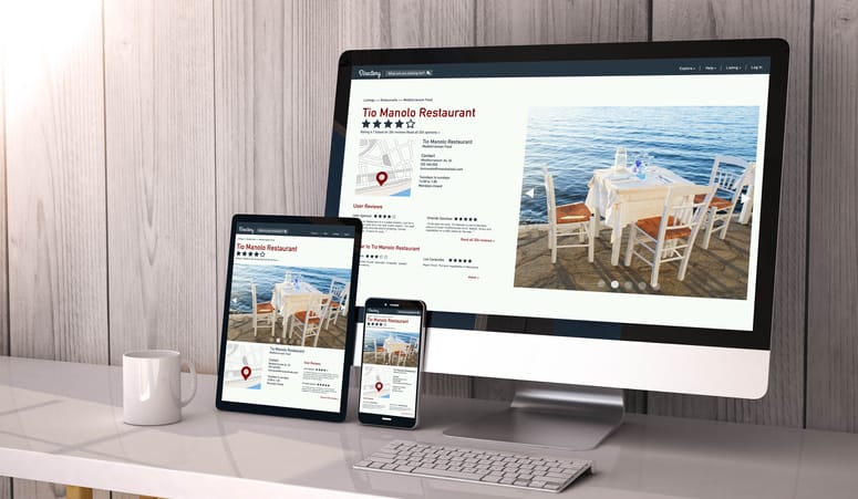
A responsive website can be described as a website design that permits website pages to be easily displayed on all devices and screen sizes. They do this by adapting to the screen of a laptop, smartphone, or tablet. This is achieved through Cascading Style Sheets (CSS) with the help of several settings to adhere to different styles properties based on orientation, size, color capability, and other features found on your device.
How do you know if a website is responsive?
You can easily know if a website is responsive or not by going to your web browser and performing the following:
- Open the browser e.g. Google Chrome
- Go to the website page
- Press Ctrl plus shits plus I to open Chrome DevTools
- Press Ctrl plus Shift plus M to toggle the toolbar of your device
- View your page from a desktop, tablet, or mobile device
There are also tools like Google’s Mobile-Friendly Test that can be used to find out if the website is mobile-friendly.
Why You Should Make Your Website Responsive
A responsive website is designed in such a way that it automatically adapts to its interface as per the screen of the device being used. Considering the rate at which technological innovations are happening, it is important to consider different resolutions and screen sizes when creating a website.
Below are reasons why every website should be responsive:
1. No restrictions with regards to devices and screens
As expected, a responsive website should be able to do away will all boundaries or restrictions regarding the screens and devices a website can be accessed on. It should not only offer access to all screen sizes but also ensure the best user experience on those platforms.
The interface should automatically adjust in such a way that website visitors can read content easily while at the same time enjoying the overall experience. The interface should also cater to the needs of those who don’t own smartphones or desktops for that matter. The idea is to ensure that the website can be accessed by anyone using any type of device.
2. More website traffic
When many people have access to your website, it means that the chances of having increased overall traffic are also high. On the other hand, if only a few devices can be used to access your website, then it means you will have a smaller audience or fewer people visiting the website. For example, you may have an interesting article on your website. But because your website is not responsive, some users will not be able to access the website and read the article.
3. Makes it easy to analyze traffic in one place
Having a responsive website interface allows all the website traffic to be gathered in one place, regardless of the devices being used. This makes it easy for you to know what type of devices your audience is using to visit your website when you are analyzing website traffic. It also helps to keep data in a structured manner and in one place.
4. Improved Search Engine Optimization (SEO)
Search Engine Optimization, popularly known as SEO is a technique used to improve the online presence of a website by ensuring that it performs well on Google’s search page rankings. A strong online presence increases the chances of your website being noticed by users.
Statistics show that very few users go past the first page of Google’s search results. This means that if your website doesn’t appear on the first page, then few people will get to notice its existence. Google generally gives priority to websites that are mobile-friendly.
5. Improved user experience
A consistent design generally improves user experience. Having a website design that is compatible with different screen sizes ensures consistency of the interface, therefore improving the overall experience of users. When users are able to access a website through any device and navigate easily, they are likely to stay longer and even come back when need be.
In general, every website should be responsive. We live in a world that’s largely driven by technology and new devices are being introduced to the market almost every day. It is important to ensure that your website is responsive by taking into account the needs of every user.
LIKE AND SHARE THIS ARTICLE:
About the Author: Brick Marketing President, Nick Stamoulis
 Nick Stamoulis is President of Brick Marketing and has 28 years of digital marketing experience. He works directly with clients on strategy and implementation, helping solve complex marketing, lead generation, and sales challenges. He is a strategist with expertise in SEO, AI SEO (GEO) and Answer Engine Optimization (AEO), content marketing, social media, pay per click advertising, and conversion improvement. In addition to marketing consulting, he provides expert level marketing leadership, working closely with organizations to drive strategy, execution, and performance as a fractional CMO.